Amazon Music
Platform Design and Ecosystem • 2013-2015
2016 was a year of evolution and growth for Amazon music. Initially launched as a limited catalog music library in 2014, the service needed to expand its catalog from one million songs to 10+ million songs. As a result, the interface needed to scale six platforms with a common information architecture and a unified visual design language.
Role: Principle Product Designer

Overview
Originally launched in the Spring of 2014, the Amazon Music product and team were undergoing massive change. The overwhelming success of the original product led to plans to expand and refine the product feature set.
In 2015 the design team had been reorganized as a centralized team for music product and was tasked with three core challenges for the next major launch of Amazon Music. First, create a consistent browse/navigation pattern that encompassed the entire music catalog–not just the Prime Streaming catalog, and make that worked across all devices. Second, integrate the functionality of Amazon's voice assistant Alexa seamlessly into the experience. And finally, develop one a revised design system that would communicate the new refresh and help tie all the devices together.
Our challenge was to expand the user interface to accommodate the full Amazon Music library, enable Prime and full subscription users, update the visual language on all platforms and to integrate Alexa in the product service.
Target Customer for Amazon Music
Amazon wanted a clear focus on casual listeners and specifically listeners with families. For these users, the benefits of a Prime membership was an easy way to get introduced to the music ecosystem. And with the introduction of the Echo and Alexa, natural voice interactions became an entirely new way of attracting new customers. For our listeners, stations and playlists are great ways to enjoy music with little work, while still having the massive catalog available at the same time.

Our First Challenge - Reorganizing the Content Structure
Our first challenge task before any of the visual or interaction work started with creating a content organization that allowed users to find music with minimal steps. Originally Prime had a catalog of 1 million tracks–organized mostly by structures of music stations and playlists, but the new service would include all of Prime plus the entire catalog as an on-demand upgrade.
Many approaches were explored by the team, but we eventually landed on a tasked based model consisting of four pathways. The first path "Browse" allows the user to explore different genres of albums, playlists, and stations. Based on our user studies and metrics on the existing usage, this path would be used occasionally. The next path "Recents" would allow users to quickly return and pick up where they last left off. We expected most users to use this path very frequently. "My Music" bookmark and return to old favorites easily. "Search" was the last method where the user knows what they want, but doesn't want to waste time browsing. At any point, the user could invoke the Alexa command initiate music in a more natural way.

Various explorations of organizing the user's existing music library with the full Amazon catalog of music, stations and playlists.
Unifying the Navigation
Our next task was to devise a navigation system that would be easily understood and transferable between devices, yet still, conform to the norms and recommendations of the native platform. iOS had a standard bottom navigation model and Android was moving towards that direction. Similar traits could be found in the PC application and Web applications, though we did have to account for the Amazon header navigation. The Fire TV UI was the most visually different, but the navigation scaled well with its d-pad interaction model on 10 ft experience.

Sample wireframes from the more popular products that helped determine the UI/navigation model.
Unified User Experience Across Platforms
The final stage of the process was developing a visual language system that took into the various platforms and utilized both the new content structure and navigation systems. The finalized result was an extensible visual language with UI elements that could scale throughout the full family of products for Amazon Music.

Sample screenshots that show the consistency across the major products of Amazon Music.
Mobile Experience


Screenshots taken from the iOS product
PC Application


Music Transport Controls
The transport controls became a point of emphasis due to the typically high use from customers. Our team needed the play, pause, FFW and RWD controls to be easily accessible, yet not interfere or overload the navigation bar buttons that allowed the user to move between sections of the app.
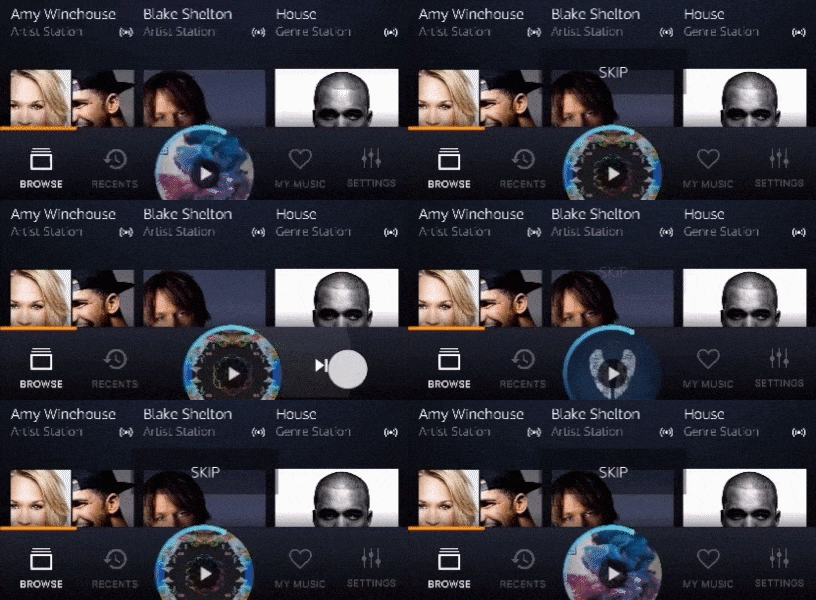
Our solution led to an innovative gesture-based UI that allowed for the standard transport controls while giving the application an iconic UI element to anchor our UI language around. The user simply gestures the album back or forward to skip/rewind or up to go to the Now Playing screen.
A provisional patent has been filed for the Amazon transport control and is pending US Patent approval.


Examples of how the media transport controls work
Design Process
Competitive Auditing
To get the process started, we did a quick audit of the key players in music. We looked at their various treatments of the navigation, visual design and content organization. This enabled us to determine general trends and areas of opportunity for our product.

Wireframes/Page Schematics
Rapid sketches in basic wireframes allowed us to test various layouts and navigation options across the devices with low effort before finalizing design decisions. Wireframes were considered very low fidelity screen mockups and were quickly transitioned into visual prototypes.

Visual Explorations
When developing the visual language, we chose to focus on three elements to help determine our new look and feel. First was the album art. Used by albums, playlists, and stations, the album artwork is one of the most predominant elements on our UI. Second was the selection of typography and type scale. Finally, the selection of the color and theme would overall determine how our application felt to users.
The following framework was used to develop our visual language, the to document in a comprehensive design system.


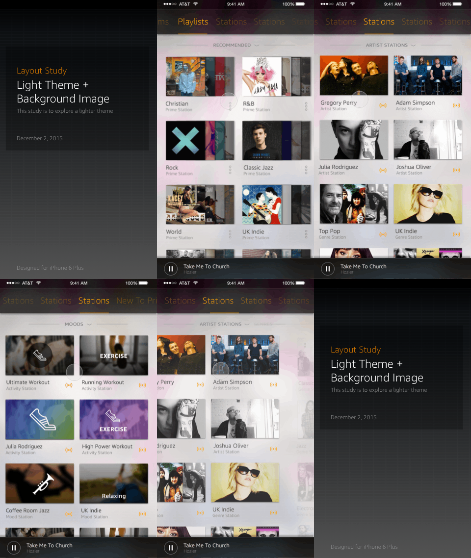
Explorations of album art variations on light and dark themes

List view studies using album art variations on light and dark themes
Rapid Prototyping
Rapid prototyping was used throughout the concept of navigation flow, visual design and development. These product demonstrations allowed the key stakeholders to fully experience the potential product and to help drive consensus in the decision making. Prototypes were equally used during the development process to communicate with the engineering team on design intent with regards to transition and motion design.

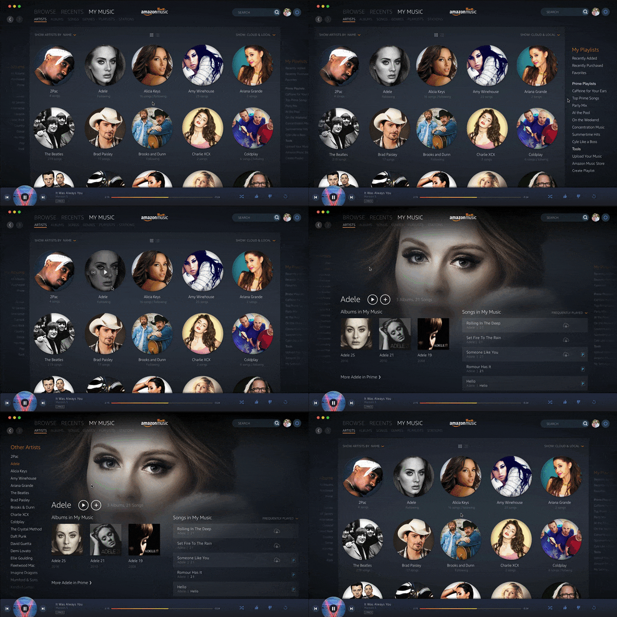
Sample prototype for the PC app built using Principle

Sample prototype for the iOS app using PIxate


Sample prototypes that were used to for cover art and theme selection
CarStory Market Reports are full responsive ready and allow more information density to be displayed in desktop resolutions.
Animation and Transition Design
Animation and transitions of element in an application help bring its content to life. We used subtle transitions between screens and with page content when it deemed appropriate. The result was a UI that felt fresh and fluid.


Product Demonstration Movie
Below is a sample product demo used to sell the final concept prior to development. The results were cumulative from the visual and prototypes during the exploration process.

My Role
My role at Amazon Music was Art Director, where I helped the team develop the common navigation system and overall visual language of the products. On these projects I was primarily responsible for generating various explorations of the visual system, generating prototypes for the animation design and helping to lead the design execution of the iOS phone and tablet versions of the application.